BLOG/Strategy & Planning
Designing & Building Product Finder Quizzes for eCommerce
Prior to Warby Parker, when I heard the term “online quiz”, I usually thought about my Facebook feed getting carpet-bombed by people projecting what Disney Princess they were most like, what age they would live to, or where their perfect vacation would be. These quizzes were shallow, the logic was confusing, and overall, of no benefit other than to just pass the time (and probably also to steal a little bit of your data). Once Warby Parker came online, the idea of getting a product that was expertly selected for you, while you did nothing more than answer some simple questions about yourself, was just too good to pass up. (For all you fact-checkers out there, I’m sure there were other successful quizzes preceding Warby Parker. This just happens to be the first one I was drawn to.)
So, what's the big deal about quizzes? Why are they beneficial? Would it be a good idea to integrate one into your eCommerce store experience?
Well, the answer is, it depends. In this post, I will go through the benefits of quizzes and if a quiz is right for your eCommerce store. After that our resident UX Designer, Amy Ackerman, will describe how you build a quiz as well as best practices to follow. This will all be followed up by some of our favorite eCommerce website quizzes.
Build Customer Confidence
Should you add a quiz to your eCommerce website?
It depends on a few things. Do the products you are selling require a large amount of customer confidence? In Warby Parker’s case, they do. Now, I would not consider myself a fashionista by any means. I have a rather difficult time figuring out what color of t-shirt to wear, and there are really only about 3 colors in my closet. So, when it came to getting new reading glasses, I was left feeling quite unsure of my ability to make a good decision. With Warby Parker, the idea of answering a few simple questions and poof!, a stylist (or more realistically an algorithm) would choose a few pairs of glasses that would be perfect for me, was easily the best answer. All I wanted was confidence that I was making the right choice, and Warby Parker gave that to me. Customers want to feel confident that they are trading their hard-earned cash for a product that they feel has been perfectly selected for them. Now notice I said “they feel has been perfectly selected for them” and not “has been perfectly selected for them”. Not all quizzes are perfect. They will not always find your glass slipper, Cinderella. But, they can get pretty close, and it is with that added confidence that the customer rarely leaves feeling unsatisfied. This leads to fewer returns, fewer abandoned carts, and therefore more sales.
Reduce Customer Anxiety
Something else to consider for your eCommerce website is the size of your catalog, or more importantly, your total number of individual SKUs. A large amount of choices increases customer friction and anxiety. There is a popular restaurant near our office called “Fish Shop''. I have dined there many times. If you find yourself in San Diego, I recommend it. However, the way their menu works is that you first have to choose what type of fish you want out of 12 different types. Next you have to choose what type of marinade you want on your fish, so there are 8 more choices. After that, you pick a style; that’s 4 choices. So all in all, you went there to get a quick bite, and now you are faced with picking the perfect lunch out of 384 different combinations! What if I would have liked something else more? What if the marinade I chose doesn’t go well with the fish? What if the style I chose doesn't go well with the marinade I chose, which doesn't go well with the fish that I chose?! When there are too many choices you feel like you have no chance of picking the perfect one. Whatever you chose, there had to have been something better. This will lead to a lack of confidence in your choice, which leads to general discontent, also known as Choice Paralysis. This concept was made famous by Barry Schwartz in The Paradox of Choice. The more choices a person has the less likely they are to make a choice. The amount of products you carry on your eCommerce website could tell you if a quiz is right for your customer. If your eCommerce store has an amount of SKUs that would feel exhausting to scroll through, then it might be time to implement a quiz.
“One effect [of choice] paradoxically, is that it produces paralysis, rather than liberation.” Barry Schwartz - The Choice Paradox
Reduce Friction
Some other questions that come up are: How much research does finding the right product require? How much knowledge do people already have when they start the process? How easily obtainable and digestible is information on your product?
We are currently developing a quiz for a jewelry company that is mainly based around engagement rings. Luckily, I had a very recent experience with the process of buying an engagement ring. I love my, now, wife. I can’t imagine not being married to her, but the idea of starting the process of finding the perfect engagement ring was one of the most intimidating experiences in my life (maybe that's why it took so long for me to pop the question). My knowledge on the subject was zero. It was less than zero. I didn’t even know what I didn’t even know. But, I did know a lot about my wife, as hopefully most people who are about to propose would. With that in mind, the quiz that we are developing asks questions to the proposer about the propose to get a better idea of their style and inevitably, what engagement ring would be perfect for them. It asks what kind of clothes they wear, if they are outgoing or more reserved, where their favorite vacation would be, etc. We wanted to keep the questions simple and make sure that they only required on-hand knowledge. This knowledge could then be translated into some recommendations around engagement rings. Which means that the user gets to skip an intensive and intimidating process of engagement ring research, by simply taking a quiz. The idea around this is to reduce friction by answering difficult questions, with simple ones. Do you remember that one girl in high school who just loved taking tests? Wonder what she’s doing now? Well, she’s probably a doctor, but the point is that there was only one person who liked taking tests. That is why, with quizzes, make sure that the questions are easily answered, preferably with no research. These tests should be fun, because unlike in high school, no one is being forced to take these tests.
With that I will pass it off to Amy Ackerman, our resident UX Designer.
Ecommerce Quiz Types
So how do you build a good ecommerce website quiz? Before you write your first question, choose the logic that makes the most sense for you, your customer, and your products. The quiz logic serves questions and delivers results to users. Having the right logic means that users will get a good result that validates the work they put into answering the questions. It also means less customer service work and fewer merchandise returns for you.
Quiz logics are integrated into the app or platform that you build your quiz on, so choose your tools carefully.
Let’s explore a few different kinds of quiz logic.
1) Flowchart
Users taking a flowchart quiz navigate down through a tree; which question they’re asked next depends on how they answered the previous question. Eventually, the user answers a final question and receives their result based on that final answer.
Flowcharts are flexible for a variety of different styles, groupings, and products. They also are great for excluding large sets of products very quickly. However, flowcharts can be very restrictive. A single question can dump a user in the wrong branch for them, and getting them back to a valid answer may be impossible.
Testing and validation are key when building a good flowchart quiz. Make sure that all your paths and results are validated by experts, and that users can recover to a good result if they answer a question unexpectedly.
2) Scale
Scale systems assign a point value to each question. At the end, the points are tallied, and the user lands somewhere on a two-ended spectrum. Questions can add and subtract to move up and down the scale. Myers-Briggs, DISC, and other assessments combine multiple point scales to deliver more precise answers.
Scales are binary by nature, only really handling two groups of products at a time. You can combine multiple scales, as with a personality test, but finding a place on more than four scales at one time is unwieldy. Scale logic is not very effective for more than eight product types. However, unlike flowcharts, scales offer lots of support for divergence. Users can answer questions in unexpected ways and still get a meaningful, personalized result.
3) Categories
The category logic uses multiple-choice questions that correlate to a category. At the end, the category that was chosen the most is the result. In a digital format, this system works best when supplemented with numbers. Each question adds +3, +5, or +7 to a bucket, and the bucket with the highest number produces the result.
Categories are one of the best formats for expert insight and education. Having someone who is knowledgeable about your products build the groups that the users are sorted into will help you deliver great results.
Results may be less personalized than other formats. Consider a 7-question quiz that helps you pick out what to eat for dinner. A user who gave three “Italian food” answers, two “Chinese food” answers, and two “Mexican food” answers will get the same result as a user who answered all seven questions “Italian.” Assigning staggered point values will help to reduce this personalization problem and reduce ties.
4) Advanced Filtering
Advanced filtering walks users through the product taxonomy. Each screen provides education around a product facet and asks “Do you like this? Do you want this included?” At the end, there is a product listing page with all products, with all filters that the user selected activated. While the results may be the same as going to a category page and checking certain filters, it can reduce the stress and choice paradox of the category experience, especially for novices.
Filtering is the best format for directing a user to a single product, but it relies on a clean, helpful product taxonomy to start with. Walking through an entire taxonomy can take time, so narrow down your attributes to only the most important.
Best Practices for Website Quizzes
Create a Clear Correlation.
Delivering a valid result based on the questions you asked is the most critical piece of constructing a quiz. Users take quizzes every day and know when they get a result they can’t trust. Make sure that the results customers get are directly related to their answers.Make Results Repeatable
Taking the quiz multiple times should give similar results each time. When users change one or two answers and get an entirely different result, it breaks their confidence in the quiz.
Tailor Length to Motivation
Users who are seeking help on high-stakes purchases expect to answer more questions. High-stakes purchases are usually either complicated (like a computer,) expensive (like an engagement ring,) or both (like a car.) No one feels confident picking out a new TV after just two questions. On the other hand, no one has the patience to answer 20 questions to find the right candy bar.
Make sure progress is clearly posted
Regardless of how many questions you need to ask to deliver the right result, always make sure the user’s progress is clearly posted. Quantify both the number of questions answered and the number of questions remaining (1 out of 10, etc.) Progress bars are a nice quick visual, but should always be an addition for numbers, not a substitute.
Educate on Technical Points
Provide illustrations, tooltips, or videos to explain complex topics. Users are taking the quiz in the first place because they don’t know enough to make an informed decision. Give them the knowledge they need to instill confidence in their purchase.
Be Respectful of Data
If you need to ask for personal data for your quiz, communicate if that data is being stored or shared and obtain permission. The best approach would be to avoid asking for sensitive data altogether. Some quizzes gate the results, requiring users to enter an email address to see what they got. This is a good approach if your primary goal with the quiz is to add to your mailing list. However, you may not see much of an increase in purchases if you choose this approach. We recommend making an email address optional.
Quizzes we love
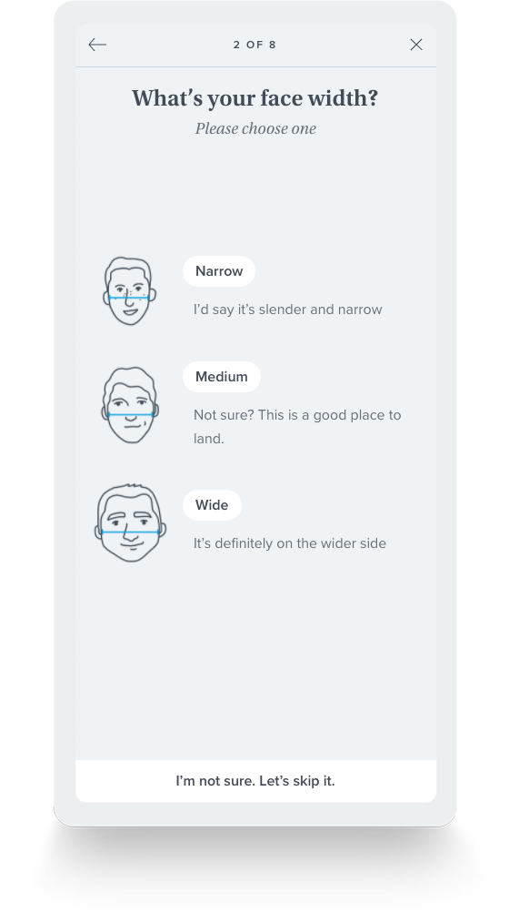
Warby Parker - warbyparker.com/quiz
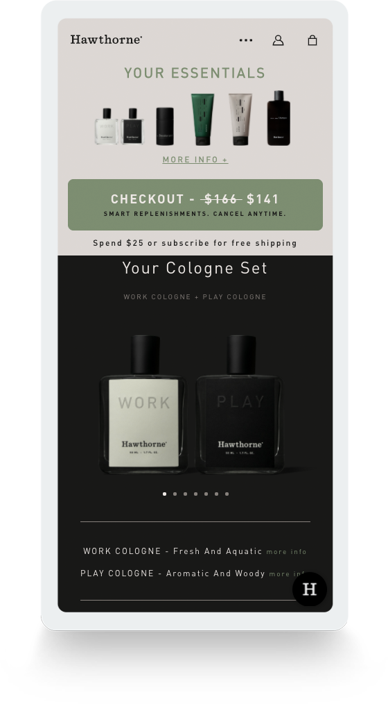
Hawthorne - hawthorne.co/quiz/
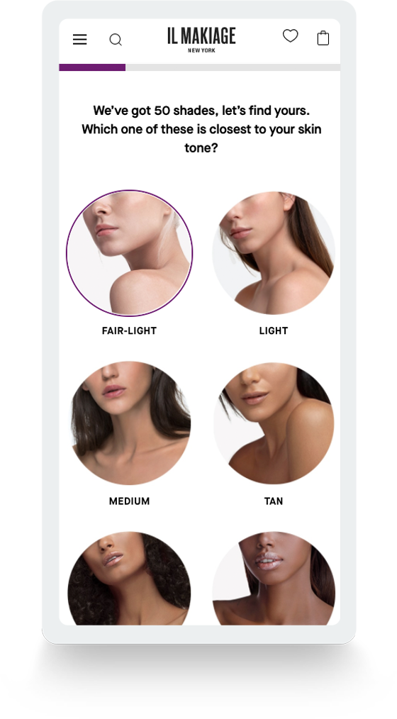
Il Makiage - ilmakiage.com
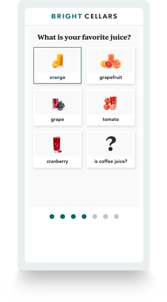
Bright Cellars - brightcellars.com/wine-quiz
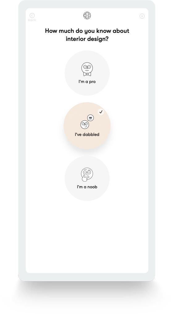
Havenly - havenly.com/interior-design-style-quiz
Thanks for checking out our thoughts around some of the ways that a quiz can not only enhance your ecommerce website experience, but also provide a way to educate your customers on your product offering and guide them to the perfect choice. If you're interested in designing a custom ecommerce website quiz, please feel free to reach out to us for a consultation.
More from the
DO Blog


3 Customer Motivation Strategies to Improve Your eCommerce i...
Strategy & Planning / July 27, 2020
View Blog Post