BLOG/Design
Fixed Navigation in Web Design and 10 Innovative Uses From Around the Internet
 There is a relatively new practice that is starting to appear on the web more often each day. This user experience/user interface trend is referred to as a “fixed” or “sticky” navigation although I like the term “weightless” for its floating characteristics. This label is given to any top navigation (or sometimes side navigation) that stays at the top of your web browser at all times, even while scrolling down the page. Now I say trend only because it is still a new practice that is being used on a frequent basis, sometimes just for the novelty. People often associate trends with practices that are not helpful or logical, but only implemented for the “cool” or “fresh” factor. The reality is that in some cases a trend can become timeless if it is effective, purposeful, and logical. This is how I look at fixed navigation if excecuted properly.
Some people might not even realize how many sites they use everyday utilize this type of navigation. Some popular sites that use this navigation are Facebook, Twitter, Gmail, and Pinterest to name a few. Being someone who is very aware of web practices, even I forget that sites like Facebook use this navigation. Noticeability is an effective way of judging whether the navigation is successful or not. The weight and prominence of your nav bar needs to be balanced to avoid distraction. There are certain websites that utilize this navigation, but unlike Facebook, the bar is too large, dark and/or overpowering. Not only can these be overwhelming to the point of claustrophobia, they actually remove the attention away from the content and direct it to the navigation bar instead. This is exactly what you want to avoid.
How to properly use a fixed navigation bar
In order for this type of navigation to be effective there are a few guidelines that I believe should be followed. These are obviously not laws or rules but general practices.
Weight
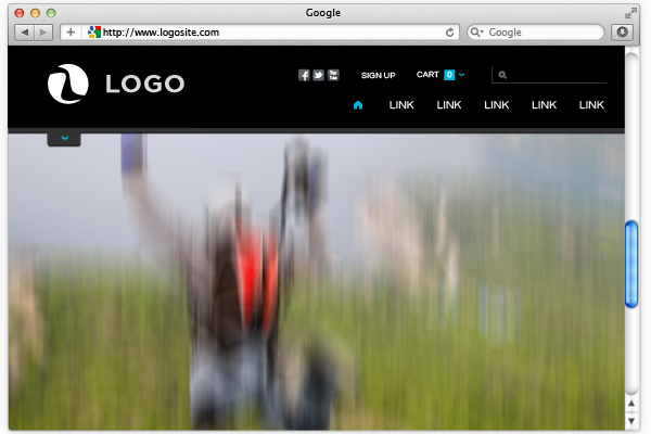
As I previously mention, the weight of the navigation bar should be heavily taken into consideration. If the navigation bar is coated with strong saturated colors or bold/ dark colors such as black or dark grey, the bar will need to be fairly thin. There have been plenty of times where this navigation bar is too tall, taking up too much valuable real estate. When scrolling down pages with these "tall" navigation bars, I feel like I am missing important content while feeling trapped. Mind you this is on a 27” monitor, cit is hard to imagine what it would look like on a 13” MacBook. On the other hand, sites like Burton.com have a fixed navigation bar just as tall as this one, but still work . This site has a sticky navigation bar within certain store product pages that allow you to navigate through types of products. The reason why this one works well is because the bar is very light and even slightly transparent. The light color doesn’t anchor your eye at the top, and the transparency allows you to see the content flow past the browser window. Additionally, even Gmail uses a 110px white and light grey fixed nav and there is a good chance you never even noticed because of its soft, light presence.
There is a relatively new practice that is starting to appear on the web more often each day. This user experience/user interface trend is referred to as a “fixed” or “sticky” navigation although I like the term “weightless” for its floating characteristics. This label is given to any top navigation (or sometimes side navigation) that stays at the top of your web browser at all times, even while scrolling down the page. Now I say trend only because it is still a new practice that is being used on a frequent basis, sometimes just for the novelty. People often associate trends with practices that are not helpful or logical, but only implemented for the “cool” or “fresh” factor. The reality is that in some cases a trend can become timeless if it is effective, purposeful, and logical. This is how I look at fixed navigation if excecuted properly.
Some people might not even realize how many sites they use everyday utilize this type of navigation. Some popular sites that use this navigation are Facebook, Twitter, Gmail, and Pinterest to name a few. Being someone who is very aware of web practices, even I forget that sites like Facebook use this navigation. Noticeability is an effective way of judging whether the navigation is successful or not. The weight and prominence of your nav bar needs to be balanced to avoid distraction. There are certain websites that utilize this navigation, but unlike Facebook, the bar is too large, dark and/or overpowering. Not only can these be overwhelming to the point of claustrophobia, they actually remove the attention away from the content and direct it to the navigation bar instead. This is exactly what you want to avoid.
How to properly use a fixed navigation bar
In order for this type of navigation to be effective there are a few guidelines that I believe should be followed. These are obviously not laws or rules but general practices.
Weight
As I previously mention, the weight of the navigation bar should be heavily taken into consideration. If the navigation bar is coated with strong saturated colors or bold/ dark colors such as black or dark grey, the bar will need to be fairly thin. There have been plenty of times where this navigation bar is too tall, taking up too much valuable real estate. When scrolling down pages with these "tall" navigation bars, I feel like I am missing important content while feeling trapped. Mind you this is on a 27” monitor, cit is hard to imagine what it would look like on a 13” MacBook. On the other hand, sites like Burton.com have a fixed navigation bar just as tall as this one, but still work . This site has a sticky navigation bar within certain store product pages that allow you to navigate through types of products. The reason why this one works well is because the bar is very light and even slightly transparent. The light color doesn’t anchor your eye at the top, and the transparency allows you to see the content flow past the browser window. Additionally, even Gmail uses a 110px white and light grey fixed nav and there is a good chance you never even noticed because of its soft, light presence.
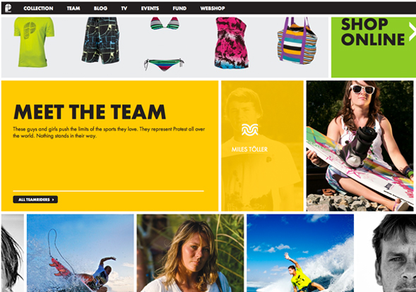
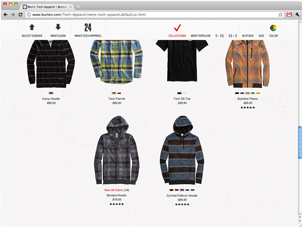 Burton.com uses a fixed nav in their product sections so that users can easily filter product types, colors, sizes and more.
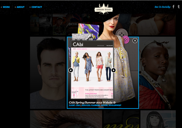 Aardvark Brigade uses a tall, heavy sticky navigation bar can get in the way of content and distract the user. The actual links in the navigation bar are minimal and might not be worth the amount of pixels the bar fills.
When to use a fixed navigation bar
It is easy to want to turn every navigation you build into fixed navigation because of the novelty. The navigation should add value to the site and not detract from it. In the early days of the fixed navigation one could argue value was added as a result of any fixed nav just from an impact standpoint. This novelty will clearly not last for long. I give it 6 months before we are all sick of it.(If you aren’t already) Save the fixed navigation for when it is necessary or for when it will actually improve the user experience. Flier websites won’t need it, application promotional websites probably won’t need them, and agency websites probably won’t need them. (Although it wouldn’t hurt if it works. This might be the only place where using it just for the novelty might be suitable.)
The best sites to use it on are the ones with heavy content and a few main areas of navigation that are frequently used. If a user is ever lost they can quickly reference the navigation. Also any site that has a user profile page with a “home” type of news feed and additional user options would be a good candidate. Websites for companies that are trying to sell you their products would also be an effective usage. These sites often have a cart and potential for a user to be logged in. The fixed navigation allows the users to access the “cart” as well as any product or category in the shop at any time. Web applications are also a good place to use the fixed navigation bar so that the user gets the feeling of being within an application. Finally, "Single Page" sites with long vertically scrolling content would definitely benefit from a fixed navigation bar so that the user can easily navigate to desired areas of the site without scrolling through data that might not interest them.
Functionally, this type of nav bar seems to make a ton of sense for a good portion of websites. Why not keep the means of navigating through the site right at the fingertips (or mouse pointer) of the user? It seems that this will open up navigation possibilities for the future, such as hidden navs that pop-out or open up out of an icon or tab that stays with you as you scroll down the page. Why limit the navigation to just the top bar? How about two levels of fixed navigation? Maybe even three levels? Okay that might be overkill but hey, it could work.
Aardvark Brigade uses a tall, heavy sticky navigation bar can get in the way of content and distract the user. The actual links in the navigation bar are minimal and might not be worth the amount of pixels the bar fills.
When to use a fixed navigation bar
It is easy to want to turn every navigation you build into fixed navigation because of the novelty. The navigation should add value to the site and not detract from it. In the early days of the fixed navigation one could argue value was added as a result of any fixed nav just from an impact standpoint. This novelty will clearly not last for long. I give it 6 months before we are all sick of it.(If you aren’t already) Save the fixed navigation for when it is necessary or for when it will actually improve the user experience. Flier websites won’t need it, application promotional websites probably won’t need them, and agency websites probably won’t need them. (Although it wouldn’t hurt if it works. This might be the only place where using it just for the novelty might be suitable.)
The best sites to use it on are the ones with heavy content and a few main areas of navigation that are frequently used. If a user is ever lost they can quickly reference the navigation. Also any site that has a user profile page with a “home” type of news feed and additional user options would be a good candidate. Websites for companies that are trying to sell you their products would also be an effective usage. These sites often have a cart and potential for a user to be logged in. The fixed navigation allows the users to access the “cart” as well as any product or category in the shop at any time. Web applications are also a good place to use the fixed navigation bar so that the user gets the feeling of being within an application. Finally, "Single Page" sites with long vertically scrolling content would definitely benefit from a fixed navigation bar so that the user can easily navigate to desired areas of the site without scrolling through data that might not interest them.
Functionally, this type of nav bar seems to make a ton of sense for a good portion of websites. Why not keep the means of navigating through the site right at the fingertips (or mouse pointer) of the user? It seems that this will open up navigation possibilities for the future, such as hidden navs that pop-out or open up out of an icon or tab that stays with you as you scroll down the page. Why limit the navigation to just the top bar? How about two levels of fixed navigation? Maybe even three levels? Okay that might be overkill but hey, it could work.
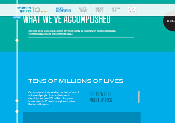
 This site uses a two tier fixed navigation that was implemented purposefully to improve usability because of the tall, vertically scrolling content.
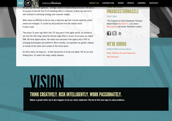
 This site uses a three tier fixed navigation system that seems to take up a little to much of your screen. The second grey bar only has three links that don't seem to warrant the amount of space given.
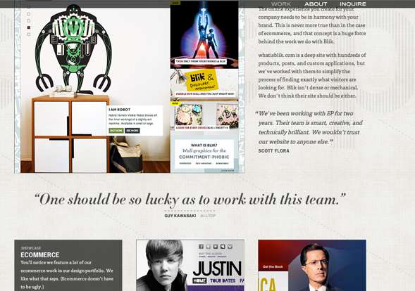
10 Innovative and Well Executed Examples
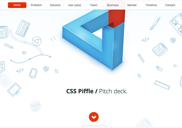
CSS Piffle
This site uses a three tier fixed navigation system that seems to take up a little to much of your screen. The second grey bar only has three links that don't seem to warrant the amount of space given.
10 Innovative and Well Executed Examples
CSS Piffle

More from the
DO Blog

Designing & Building Product Finder Quizzes for eCommer...
Strategy & Planning / December 23, 2020
View Blog Post


3 Customer Motivation Strategies to Improve Your eCommerce i...
Strategy & Planning / July 27, 2020
View Blog Post